This is a delicious fish fries restaurant. Various types of fish are sold here. All the customers coming here and eat their favorite fish fries with self-satisfaction. The area is very clean and pleasant. The company decides to design the brand to make it more effective, sophisticated and bold. So they are excited to design their brand with very significant concept.


The Fish Flame Brand
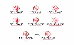
The logo on this page is the master Fish Flame brand. It is our identity, representing our organization, our people, our history and our services. Our logo has inherent value and equity that should never be diminished or compromised by:
The logo on this page is the master Fish Flame brand. It is our identity, representing our organization, our people, our history and our services. Our logo has inherent value and equity that should never be diminished or compromised by:
• Altering the logo. • Or dismantling its elements.
About brand
• Story of the brand
• Story of the brand
Brand elements
• Logo
• Inspiration
• Concept & Sketch
• Concept Building
• Logo
• Inspiration
• Concept & Sketch
• Concept Building
• Typography Research
• Recommended Typeface
• Final Touch
• Logo Edge and Resizing
• Logo Versions
• Colours
• Brand Pattern
• Recommended Typeface
• Final Touch
• Logo Edge and Resizing
• Logo Versions
• Colours
• Brand Pattern
Application/Resources
• Business card design
• Letter head design
• Envelope design
• Order Book design
• Bill paper design
• Kitchen Slip design
• Bag design
• Menu Card design
• Sticker design
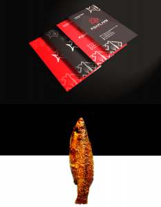
• Business card design
• Letter head design
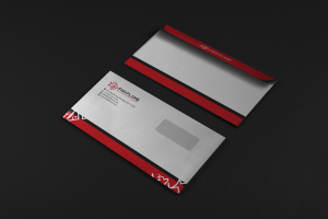
• Envelope design
• Order Book design
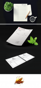
• Bill paper design
• Kitchen Slip design
• Bag design
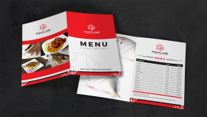
• Menu Card design
• Sticker design
• Use on different media
Logo Inspiration

Logo Concept & Sketch

Selected Concept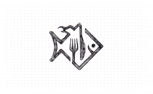
Concept Building

Typography Research
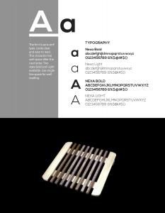
Recommended Typeface
Text Formatting
Having established The Fish Flame positioning and values, we now need to bring them to life with a visual
identity and tone of voice.
The following pages explain more about the brand elements and how to use them consistently across all media and communications.
identity and tone of voice.
The following pages explain more about the brand elements and how to use them consistently across all media and communications.
FONT SIZE AND FORMATTING
• Font size 12 point.
• Font type Nexa Bold.
• Text left aligned, central alignment used for tagline only.
• Text contrasts effectively with the background.
• Main text in upper and lower cases.
• Underlining and italics avoided. Use colour, bold or a larger
font size to highlight keywords or headings.
• Avoid stretched or crammed words, justified text and hyphenation.
• 1.15 minimum line spacing preferred.
• Include a space between each paragraph.
• Bullet points solid and bold.
Final Touch

Logo Edge, clear space and Resizing
The logo should be used as follows:
• Over light or white backgrounds that allow for maximum readability.
• In reverse when there is enough contrast to allow the logo to be visible against the back ground.
• Over light or white backgrounds that allow for maximum readability.
• In reverse when there is enough contrast to allow the logo to be visible against the back ground.
Our logo must stand out clearly. This applies not only to the background, but also to interference from nearby text, photographs and other elements that might compromise our logo’s impact. The logo may sit on a photographic background but legibility and clarity are key.
Our logo must be proportionally balanced to the size of the document being created. In all cases the logo should never:
• Bleed off the edge.
• Be cropped.
• Be invaded in any way.
• Be distorted.
• Bleed off the edge.
• Be cropped.
• Be invaded in any way.
• Be distorted.

SIZING AND MISUSE
Under no circumstances should the logo artwork be altered in any way, including distorting the proportions, altering the typography or omitting any part of the logo. Always use the master artwork and ensure that proportions are maintained
and colour is accurately matched. Here are some tips to help you resize the logo correctly.
Resizing the logo:
1. Select the logo.
2. Hold down Shift + Alt key.
3. Click, hold and drag a corner point out to enlarge.
4. Drag inward for a smaller logo.
1. Select the logo.
2. Hold down Shift + Alt key.
3. Click, hold and drag a corner point out to enlarge.
4. Drag inward for a smaller logo.
It is extremely important to use this method when scaling the logo to avoid squashing or stretching the logo out of its designed proportions.
Corporate color, mono and reversed logo
Variations
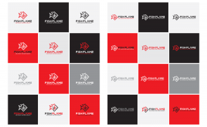
The Fish Flame logo has 24 variations as shown. It is preferable to use the ‘Corporate colour logo’, however other logo options have been created to accommodate occasions where the preferred option will not work.
The Fish Flame logo has 24 variations as shown. It is preferable to use the ‘Corporate colour logo’, however other logo options have been created to accommodate occasions where the preferred option will not work.
Print – eps. These files are used for high resolution printing for brochures and high quality marketing collateral. It should also be used when sponsorship branding is requested from external suppliers.
Color Palette

Brand Pattern

Application / Resources
Stock recommendations
Please use the following stock guide when ordering new Business Cards, Brochure, Letter heads etc.
Please note: All material must be printed on white stock.
Please note: All material must be printed on white stock.
Business Cards
350 GSM / Art Board / Matt Laminate
350 GSM / Art Board / Matt Laminate
Envelope
150 GSM / Satin Art
150 GSM / Satin Art
Letterheads / Comp Slips
90 GSM
90 GSM
Brochures
Covers – 250 GSM / Matt Laminate
Text pages – 150 – 170 GSM / Satin Art
Covers – 250 GSM / Matt Laminate
Text pages – 150 – 170 GSM / Satin Art
